How To Build Your Brand Guideline
Let’s get started- Laying the Foundation
Your foundation is key- building a solid foundation will take time, a lot of soul searching, some digging and prying, but trust me it will be worth it.
Your brand Guideline or visual identity is composed of a few parts:
1. Logo and Name of your brand
2. Color Palette
3. Design elements textures and fonts
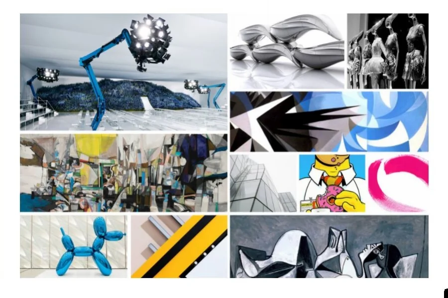
4. Inspiration board
A great visual brand guideline if assembled with the utmost care will be a powerhouse. The true test is if the core foundation can stand up to change and evolution- it all has to do with how tightly you assemble and scoop cheeseburger - if you do it right you can stack several stacks layered on the bun. All brands have a brand guideline this helps the brand understand what will be "on brand" when the brand needs to explored or executed in a medium such as a social media post, a commerial or even a photgraph.
After you have assembled your visual reference- now comes the difficult task of connecting the dots from the assemblage task to using the visual images to form the basis of creation. You might being to notice some visual elements that your are responding to that are similar to one another- this is because we all ready know subconsciously what we like- what gets in the way of developing our own brand identities is looking heavily at others for inspiration, social and cultural influences we start to not be as confident as we need to be.
For me I love circles- they represent this notion of constant evolution and growth- simplicity- beauty-
I also responded to: High contrast, Strong bold uses of color, Emotional narratives, Strong women, and Strong texture that is tone on tone.
I know that I will want to incorporate these parts into my visual identity.
It is all about what you choose to respond to as a designer it says a lot about you. For me I like to design that is in your face slightly obnoxious that forces you through the space. For me that creates an instant emotional arousal from the attendee. So much of a brand is non verbal communication. We simply do not buy products any longer- we buy into a brand philosophy and into a family. An design must engulf you and transport you into the main emotion of the overall space in a main refined and personal journey.
The Logo
Your logo should be attractive memorable and easy to read.
It should have distent bold design
It may be tagged with a tag line
Consider your brand into key words
How would you describe who you are with your logo- should you?
There are two types of logos, a word mark and an icon. A Work Mark logo is the - assembling fonts to create a hierarchy or message. An Icon- is an actual design element that uses a graphic assemblies of elements.
When selecting which one to use consider your messaging. My current logo incorporates both. For the purposes of demonstration I will be showing you my previous version of my branding.
The Color Palette
Your brand should have a primary, secondary colors for all visual components.
Consider selecting colors that best fit within what you are trying to communicate.
Once they are inline with your branding where selecting try to retain common colors sprinkled with more unique colors things to consider try not to be too trendy.
Or colors that have special significance to you. When visually creating and editing your colors please keep in mind the shape of the color palette.
Consider circles, triangles squares this will help convey the form language of the brand.
The Design Elements
An effective brand identity should have textural elements that relate you- they should be unique to your story.
Consider creating these elements that can be incorporated with all of your visual identity and help establish a consistent language again consider what is unique to you- what have you created that is special.
Let's talk font’s
Please keep it simple here lets not have a million fonts or something so weird no one can read it- they should support and not take away from your work they are teary to the composition
Consider utilizing a serif and a sans serif
Easy to read headers and body copy-
The Inspiration Board
This is the most important step to editing your images you have selected for yourself.
Consider when assembling:
What are the images that help tell your story?
What inspires you?
What you select says a lot about you as a designer
Be selective with theses. They should help tell a unique visual story about you.
Be ready to speak to these elements or explain what they are.
Putting It All Together
Assemble all components in the following order:
LOGO or name of brand
Color Palette
Design Elements (textures, fonts)
Inspiration Board
You have now completed your very own brand guideline. Which will you need as we develop your brand identity.


